

The 'mimoid' formations are considerably more complex and bizarre, and elicit a more vehement response from the observer, an instinctive response, I mean…The name he gave them indicates their most astonishing characteristic, the imitation of objects, near or far, external to the ocean itself.
― Stanisław Lem, Solaris
I’ve come to learn that illustration, far from inevitably bringing a subject closer to us, can just as easily give it an uncanny, hostile distance. A “literal” interpretation may not be impossible, but it is far from likely, and more often than not, the result of a chance circumstance rather than an intentional artistic decision… A strange paradox: coincidence is the heart of representation. There are no firm criteria for measuring fidelity to the source. The more accurate a depiction feels, the more it possibly has to hide from you. Illustration is, in short, always a problem, in much the same way that espionage, love, paranoia, and other feedback loops can hijack the facade of a given reality, via the gullibility of a nervous system at odds with the capacity for thought itself.
The majority of illustrators of course seek to “do justice” to their subjects. There are rare occasions however when they achieve a bizarre, almost mystical indifference to that which they are attempting to depict. That class of illustrator becomes something beyond a parasite, inverts itself into the primary biomorph. The fed-upon becomes the feeder. In such rare instances, the illustrations are not irrelevant, but somehow dimensionally adjacent in some disturbing, unexpected way. Stephen Gemmell’s illustrations for the Scary stories to tell in the dark series are infamously disturbing, abstracted and haunt the viewer well beyond the gruesome contents of the stories they accompany. Likewise Yoshitaka Amano’s conceptual and rarefied work for the Final Fantasy series, which gratifies us with its unlikely, aristocratic ink-washed weirdness and could not be further from the stubby world of 16-bit fantasy sprites. In both cases, the illustrators are more or less reclusive figures who assume a kind of strange persona apart from their most famous works in service of a particular franchise.
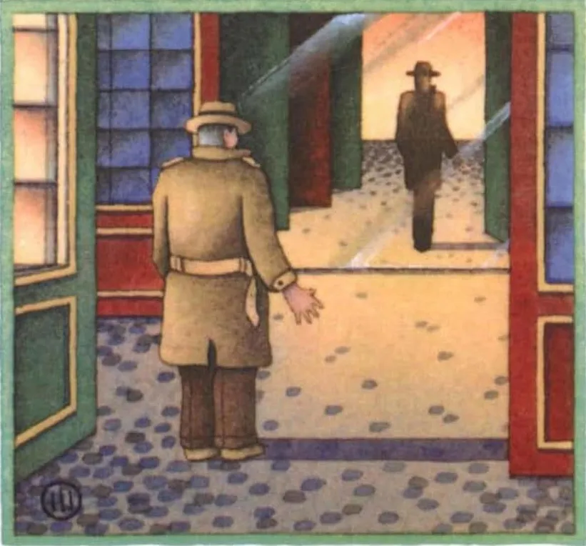
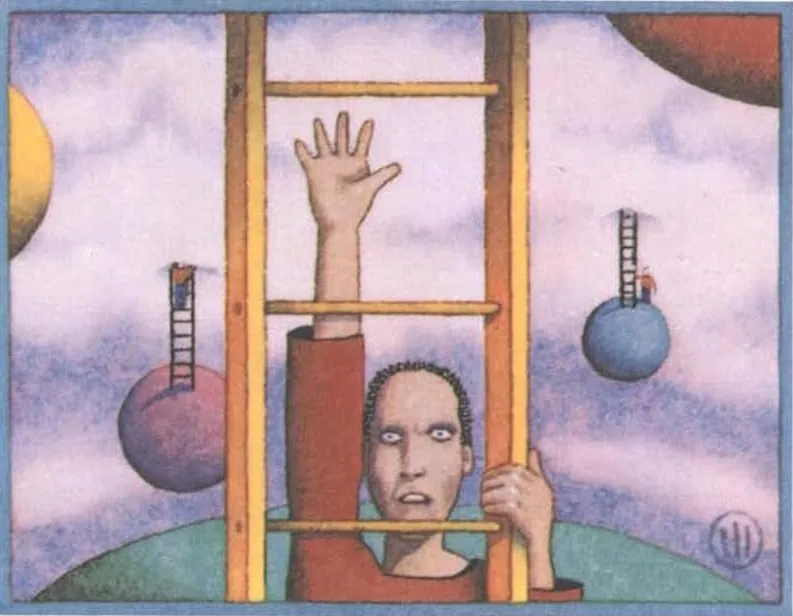
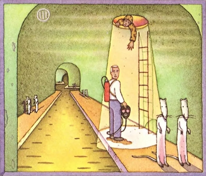
One of the strangest mysteries of illustration is that of one John Alfred Dorn III. Any English language readers of the Polish science fiction writer Stanisław Lem would likely have come across the white, almost gentle, pastel tinged, almost childlike covered editions from Harvest/HBJ Books. Each one of these has a single illustration drawn more or less from a specific episode or idea in the book. These illustrations are simultaneously soft, gentle, wavy, like some mild gag in a New Yorker cartoon, while at the same time being extremely clinical, bizarre, and (after a few minutes) genuinely threatening. Sometimes they contain “literal” scenes (exquisitely well chosen, as in the case of The Futurological Congress: From the Memoirs of Ijon Tichy with its gasmasked protagonist gawking at the bipedal rats in a Costa Rican sewer).
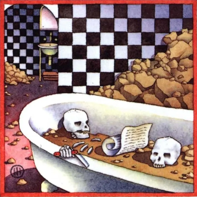
Other times, they assume a kind of metaphysical grandeur, as in the cover of Memoirs found in a Bathtub, a lonely checkboarded bathroom setting complete with skulls and scrolls.
After procuring 3 or 4 of these books, I started to wonder about the illustrator. I was surprised to find, well, absolutely nothing at all. Less than on Amano, and even less than the highly reclusive Stephen Gemmell, “John Alfred Dorn III” has seemingly zero presence outside of these very particular illustrations. I can’t even find his work for other authors; it seems like the only knowable fact about this character is that he illustrates Harvest/HBJ Books Lem covers exclusively!?
Much like the mimoid formations in Lem’s most famous novel, Solaris, Dorn seems to illustrate, mimic the content of Lem’s books in a strange way, but without giving away thereby anything else about himself, his circumstances, the reason or the cause for his doing so. It is alarming and somehow extremely appropriate.
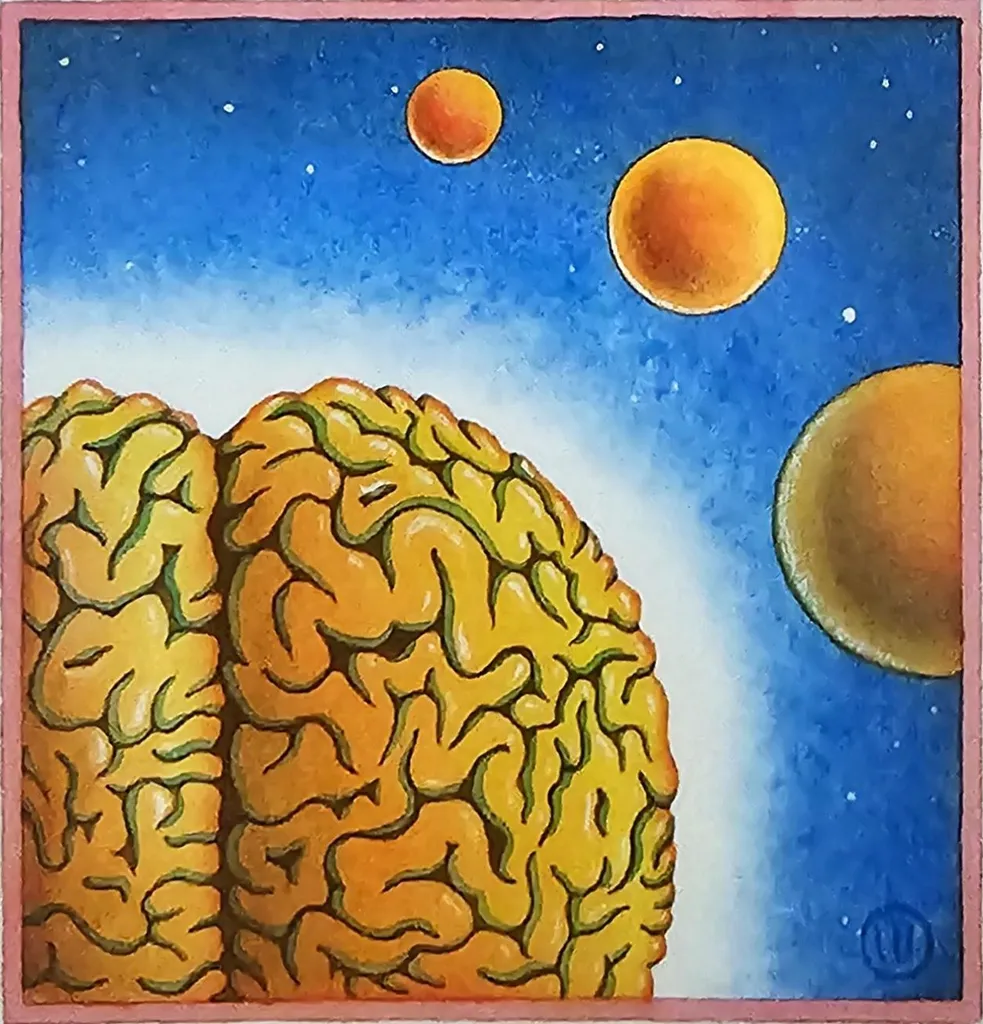
An interesting touch, the name. “John Alfred Dorn III”. Could be a science fiction character himself. Is it a fake name? The artist signs all his covers with just an encircled “III”. Sometimes, its placement is quite playful, disturbing, as in the cover of Tales of Pirx the pilot.
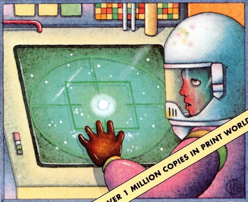
Here the “III” almost seems to replicate itself as the three breathing filter holes on the pilot’s helmet. Strange role for a signature to play, the regulator of airflow. Or maybe it makes perfect sense. On the cover of The Cyberiad, the “III” echoes the three pens in the pocket of the foremost robot. Mysterious, evocative, and romantic. What did the first two John Alfred Dorns do? Has their line continued? Beyond the “line” of the illustration, I mean…
III’s humanoid figures are especially interesting. They all tend to have this bemused, abstract comic book look to them. None of them seem to have any other emotion except mild concern. Surrounded by eyeless clones, or gigantic brains, bipedal rats, encased in a rocket, hung upside-down like the hanged man above an austere swimming pool, they are all somewhat reserved and alienated. They remind me a lot of Stephen Appleby’s style, but with no obvious punchline to tie the gravitas to anything solid. The robots on the cover of The Cyberiad have almost more emotive human characteristics than the anemic humanoids of say One Human Minute.
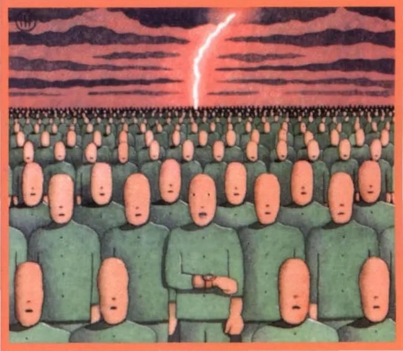
And there is almost something didactic about III’s illustrations. They would not look out of place as 1990s textbook art, or in some irreverent CD-ROM clip art collection. In particular it has the irreverent sketchy grottesco coffeehouse quality of the Art Parts series. This generic factor does immense justice to Lem’s writings, since they are often filled with a kind of mutant didacticism of their own… Fake reviews, ersatz introductions to non-existent texts, confabulated disciplines (solaristics!), all things in need of a friendly illustrative diagram. Perfect for characters who are presented as cases, “subjects” to be studied rather than people. Take the Dorn cover of Fiasko and it could, in a less sinister context, be decorating a physics problem or a photocopied high school math sheet.
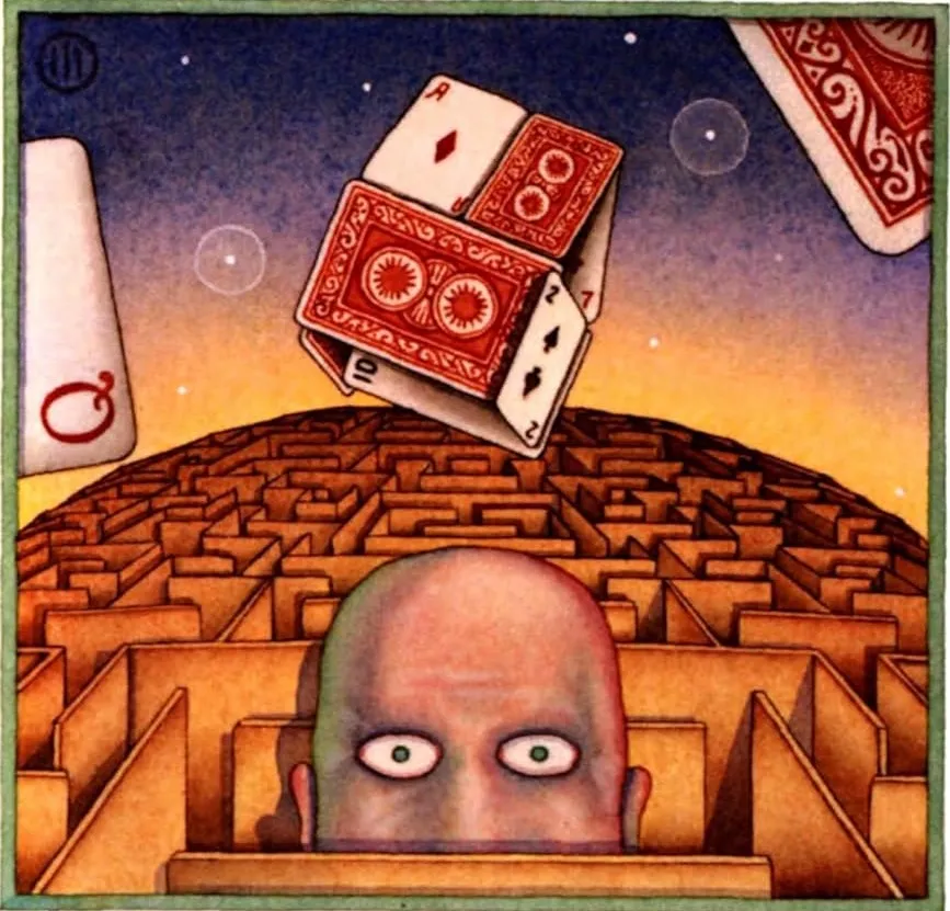
John Alfred Dorn III’s work combines a skillful reading of the source material with a quirky, metaphysical willingness to dwell in ambiguity. His illustrations are child-like, quiet, threatening and full of weird objects. The as-yet unexplainable monomania for illustrating Lem and Lem alone is paralleled only by his strangely alien name and the cryptic “III” that serves as his nom-de-plume on the canvas. As salivating as it would be for this mystery to remain an unanswered enigma, it would be equally gratifying to find more illustrations of his—Lem-derived or otherwise—and to find out more about his motivations, technique, influences, and other activities. Like the planet Solaris, around which so many experts expend so much effort, only to be met with a disorienting, mimetic, and above all active silence (silent in the way a mirror is silent!) will we ever find out more about Dorn, or will this just be another one lost to the voided pleasure of iterative speculation?
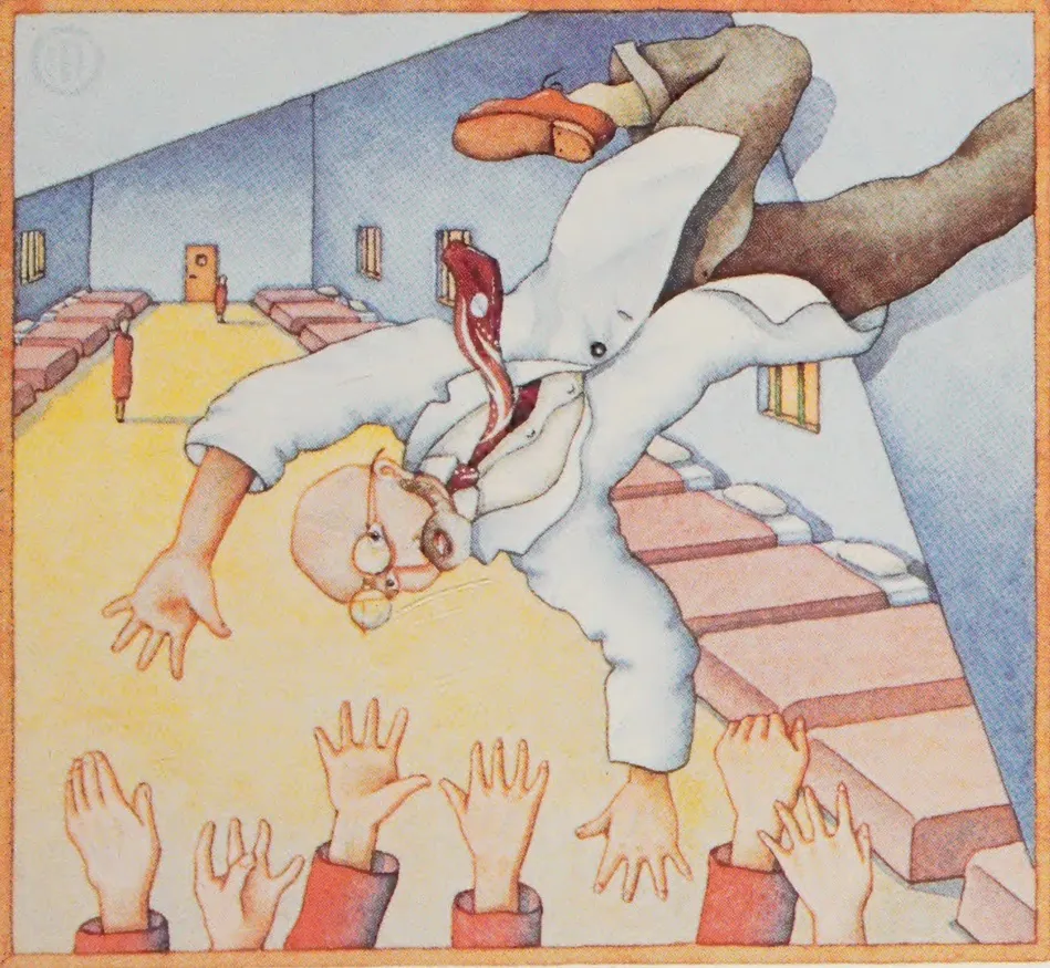
"A strange paradox: coincidence is the heart of representation."
"Silent in the way a mirror is silent"
striking phrasings & such care attended to these images. a lovely read, thank you <3